
Product Design
Redesigning the entire mobile experience for smart home management.
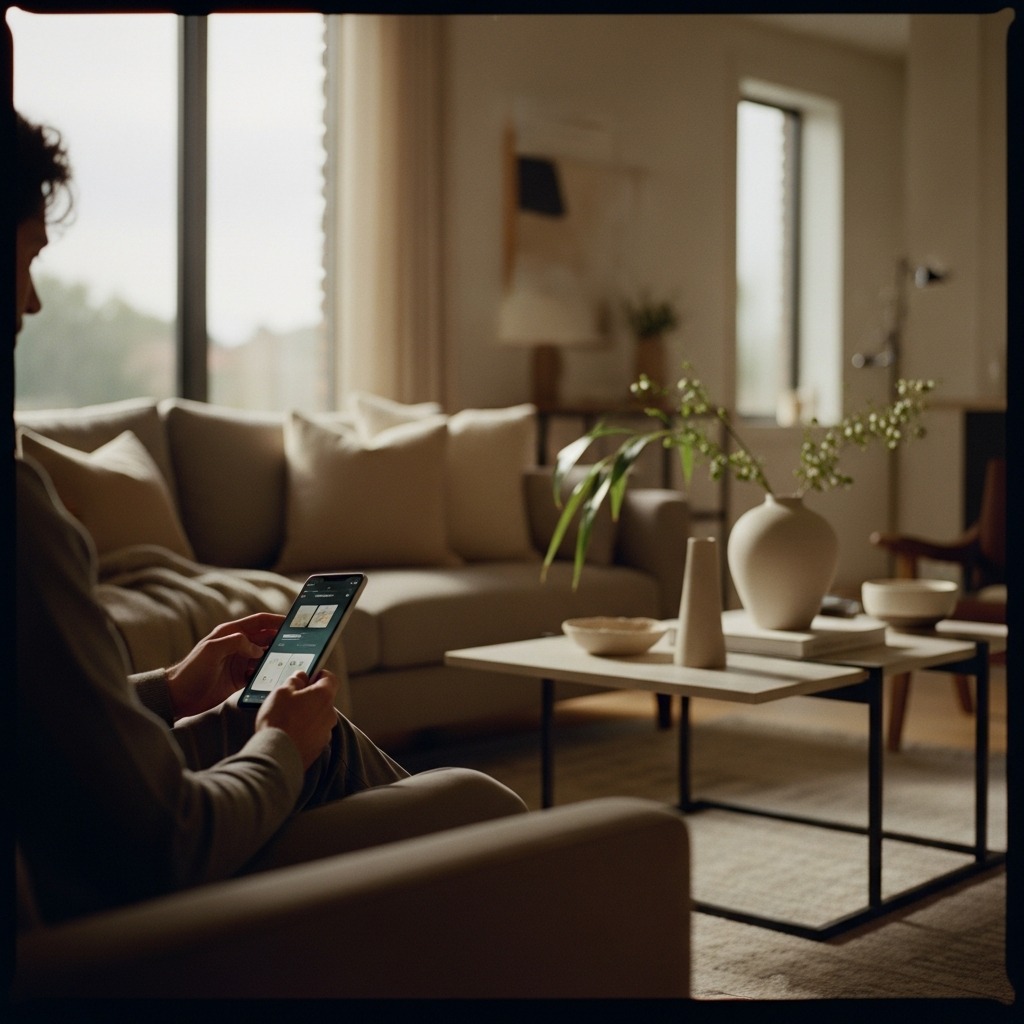
Smart home apps have a tricky design tension: they need to manage dozens of devices, sensors, and automations while feeling as simple as flipping a light switch. App4Home’s existing interface had lost that fight.
Three core problems defined the experience:
Device controls were scattered across disconnected screens with no spatial or logical grouping. Turning off the living room lights meant navigating to a completely different section than adjusting the living room thermostat. The mental model was organized around device types, not around how people actually think about their homes (by room, by routine, by moment).
Every screen threw maximum information at maximum density. Energy data, device status, automation triggers, weather, notifications: all competing for attention at once. Users described feeling “anxious” instead of “in control.” That’s the opposite of what a smart home should deliver.
Actions had no confirmation. Toggle a device and there’s no visual or haptic response telling you the command was sent, received, or executed. That silence bred distrust. People toggled switches twice, checked physical devices, opened other apps, just to verify App4Home actually did what they asked.

We rebuilt the dashboard around three principles: context, clarity, and calm.
The dashboard opens with a time-aware greeting that sets context right away. “Good morning” at sunrise with last night’s energy data. “Welcome home” when geofencing detects arrival. “Winding down” in the evening with a summary of the day’s energy use. These aren’t decorative; they frame everything that follows.
The top section shows three to four contextual metrics that shift based on time, weather, and user behavior. Morning shows energy consumption and indoor temperature. Evening shows security status and lighting scenes. The system learns which metrics matter most to each person and surfaces them proactively.
The most-used devices appear as large, tappable cards right on the dashboard. Cards show real-time status (on/off, current temperature, energy draw) and allow single-tap toggling without navigating away. The quick-access grid is customizable but ships with smart defaults based on usage patterns.
The house view brings spatial hierarchy that mirrors how people think about their physical space.
Every device belongs to a room, and rooms are the primary way you navigate. Tap a room and you see all its devices, organized by function: climate, lighting, security, entertainment, energy. This matches natural behavior: “I want to adjust the bedroom” instead of “I need to find thermostat #3.”
Rooms display in a layout that approximates the home’s floor plan. Frequently accessed rooms appear larger and closer to thumb reach. Status indicators on each room card show aggregate state: all lights off, average temperature, any alerts. You can assess your entire home in a single glance.

Creating automations in the old app felt like programming: a tree of if/then conditions that scared off most people. The redesign introduced a conversational approach: “When I leave home, turn off all lights, set thermostat to eco, and arm the security system.” Natural language makes automations readable and editable by anyone in the household.
Simple scenes (movie night, good morning, away mode) are available as one-tap presets. Want deeper customization? Expand any scene to tweak triggers, conditions, actions, and schedules. The complexity is there for power users, but it never confronts casual users uninvited.
We introduced an AI recommendation engine that suggests scenes based on behavioral patterns:
Each recommendation has a like/dislike mechanism that trains the system over time. Users stay in full control: the AI suggests, never acts on its own. This builds trust while delivering that “magical” feeling smart homes are supposed to have.


The App4Home design system was built for calm technology:


The visual language is deliberately quiet. In a home environment, the app should fade into the background, there when you need it and invisible when you don’t. Every design decision serves that philosophy: a smart home should feel effortless, not effortful.
Ready?
We'd genuinely love to hear what you're working on. No pitch, just a conversation.
Apply for a Strategy Audit